our blog
What’s the Deal with Pc3?
- Home/Dashboard: It includes all of the main content that used to exist on different internal pages.
- Email: Messaging is still a separate page as with the previous version, but the tool has been revamped with a simpler layout.
- Profile: This is a new menu item that gives participants the ability to change their profile info (a function that previously existed outside of the PC), as well as some registration specific info, all in one handy location.

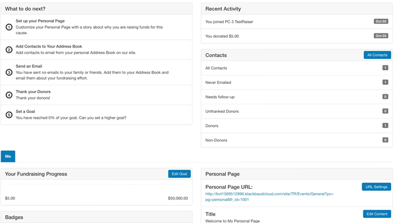
The new layout includes many of the same things that we know and love from the previous version (PC2), but they are now contained in different cards on the dashboard. This improves the PC’s user experience by keeping things simple and easy to find on one page. You no longer have to drill down into different pages within the PC to find what you need.
These cards include:
- What to do next?
- Recent Activity
- Contacts
- Personal and Team (Company, if applicable) Cards – Progress, Badges, Page Content, etc.
- Boundless Solutions – We can add any of our relevant Boundless content via cards (app callout, activity, etc.)

Remember that the PC is essentially an administrative tool for participants to check their info, send messages and help fundraise for the cause they are passionate about.
Appearance-wise, PC3’s use of white space and limited design elements might not seem exciting. However, based on our analysis of launching PC3 with several clients, we have seen increased time spent in the tool and better engagement since participants can more easily find what they need. We are passionate about design and love it as much as anyone else, but it’s a given that a clean, simplified user interface without distractions works — and Blackbaud is proving it with this new PC.
Blackbaud has provided a great baseline, and it is important to keep this simplicity in mind as you look to expand on it. A little can go a long way in the new PC3. But if you are looking to make a bigger splash, PC3 is available for you to update.
You can enhance the layout to focus on personal information and activity-based cards for greater visibility or add more branding styles to help create a stronger connection with your organization, program, event, etc.
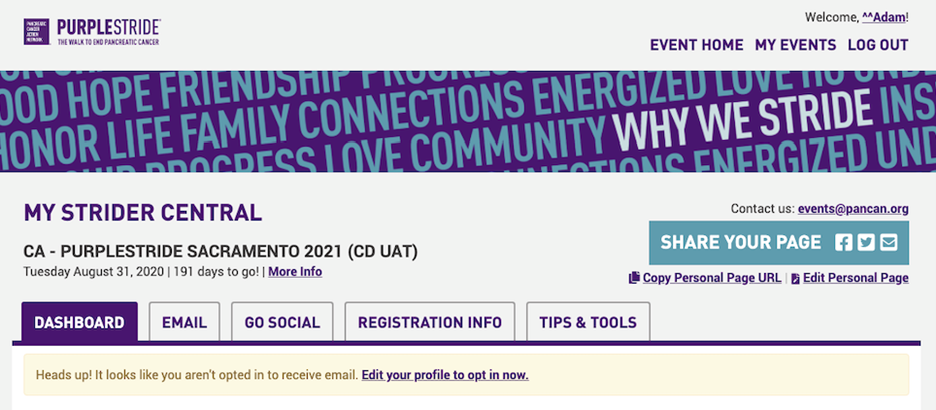
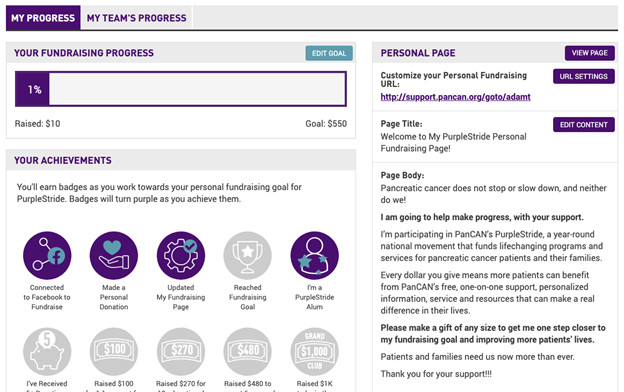
For the Pancreatic Cancer Action Network’s PurpleStride, we made these types of updates to build on the base but still kept it simple.
PurpleStride Header/Navigation enhancement:

PurpleStride cards enhancement:

What is the deal with the number 3?
In April 2020, Blackbaud upgraded its default PC to version three, Participant Center 3, is a significant overhaul to the PC in more ways than one. The previous version, PC2, was initially built in an era where smartphones and tablets were not the norm, and the idea of designing and building for mobile-first was several years away. Because of this, PC2 was not responsive (i.e., the design wouldn’t adjust for smaller devices) and not as easy to change as its former version.
What is the deal with Angular?

PC3 is based on a newer code language, Angular. Without getting too bogged down in technical details, Angular was created by an employee at Google as kind of a side thing to improve the way he was building web applications for a project. That led to an open-source and full-fledged front-end framework adopted by many developers.
Blackbaud chose this framework, among several other frameworks mixed in, for the base of PC3 for a more modern way of building the Participant Center. This made for a more logical build of their new card layout, but this also means that customizing on top of this codebase requires a web developer who understands this new coding language.
Minor changes to the out-of-the-box PC can be pretty straightforward by adding code on top of the base. Still, larger changes might involve going into the Angular code itself, making for a larger level of effort.
What is the deal with our PC2 customizations?

What is the deal with support?
What is the deal with Charity Dynamics?
If you need help upgrading to the new PC3, or would like to learn how Charity Dynamics can help you enhance the PC3 experience or set up KPIs using Google Analytics to better understand how your participants use the PC, reach out today!
About the Author

Brent Swaine
Senior UX/Designer & Developer
