A few weeks ago, the Charity Dynamics design team dropped in on Cameron Moll’s Invision webinar on Unified Design. We listened over the course of that hour as Moll led us through an exploration of the various issues that can arise when users interact with the same content across a wide range of different devices and settings. He also referenced some passionate and prescient remarks by Kevin Spacey, and settled the “GIF vs. JIF” debate once and for all…but I digress. Drawing from a deep knowledge of the history of the popular web, and using examples from some of the most widely used apps and services, Moll outlined the fundamental ethic that designers must embrace as we create user experiences within an increasingly diverse and uncharted digital environment:
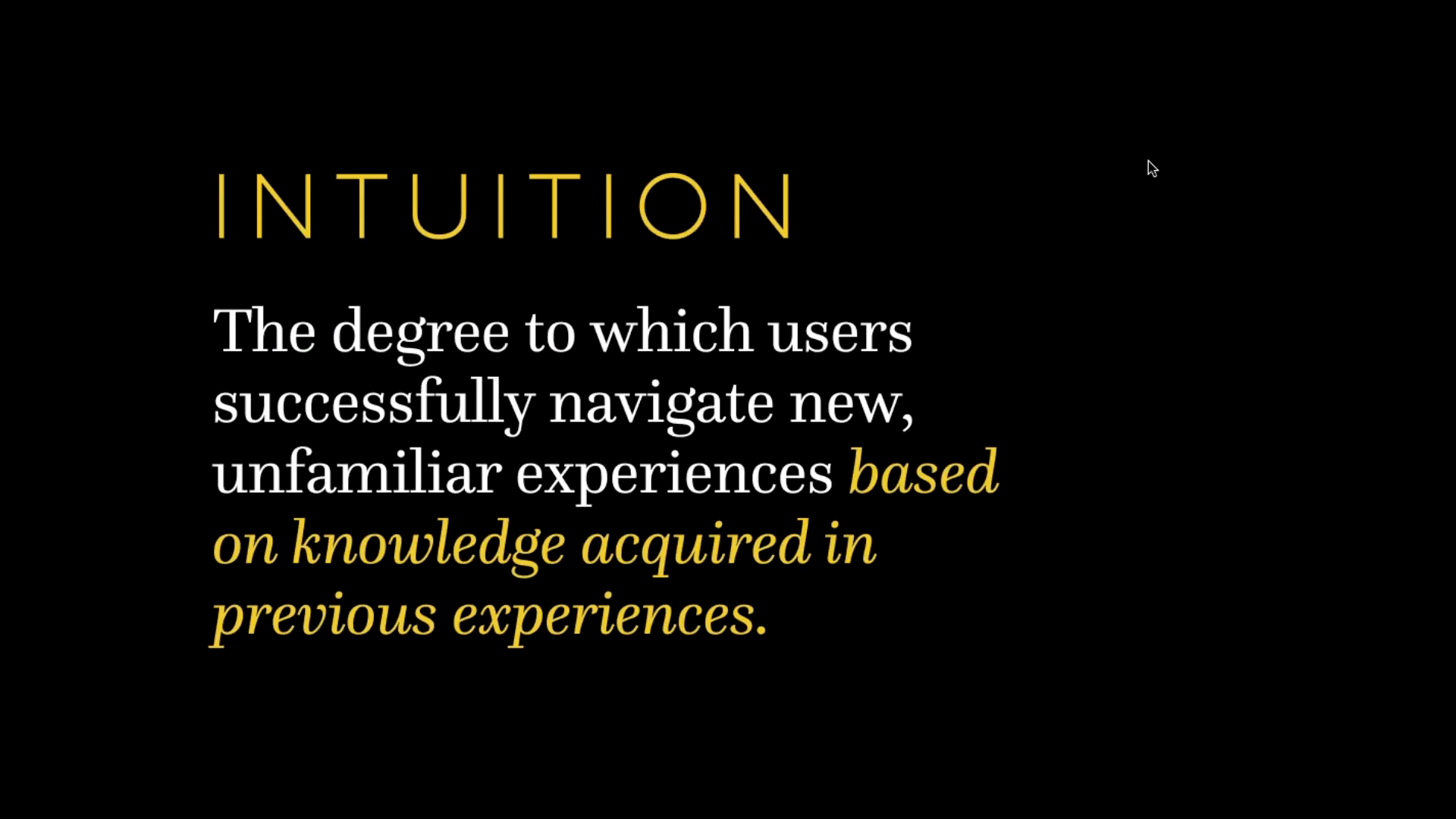
Make interactions intuitive so that users can successfully navigate new experiences based on the knowledge and expectations they’ve acquired in previous experiences.
Sounds simple. But it’s actually taken a surprisingly long time for this concept to catch on. Even now it isn’t always immediately apparent what makes an interaction intuitive, hence the need for designers to persistently test things, listen to feedback and adapt accordingly.
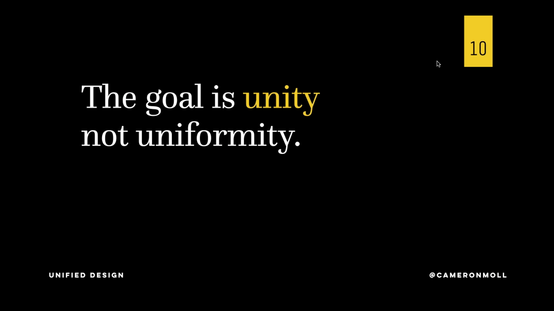
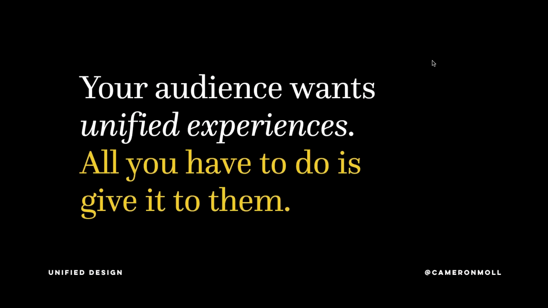
One of the most important things Moll cited was a study which found that more than 40% of people commonly begin an activity on one device and continue it on another. We all do this now without thinking about it. Imagine the social media guru who uses any device at hand to check their feeds, or the laptop user who bids on an eBay item and then uses their phone to stay updated on their bid. The most successful designs out there are the ones that bring us cohesive experiences that make sense to us regardless of where our interaction with the design begins, continues and ends. This is what allows experiences to feel natural, and ultimately it’s what keeps people engaged with the things we create. This is what Moll means by unified design.
Some products and services can get away with ignoring this concept. Paying a medical bill or parking ticket online, for example, is often much more arduous than it needs to be. People struggle through it anyway, but only because they must.
Nonprofit organizations on the other hand – being increasingly reliant upon online donors and their loyalty – do not have the luxury of forcing people through difficult or convoluted interactions. When your donors and supporters get frustrated, they leave. There’s nothing compelling them to stay. With more and more fundraising happening online as opposed to traditional channels, nonprofits may actually have the most interest of any sector in making sure that they are presenting constituents with elegant, easy experiences that are unified across a broad range of environments.
While we understand it can be difficult for nonprofits to internally justify investing their hard-earned resources into technology and design projects, the groups who do this are the groups now seeing the biggest rewards. Not just in terms of brute fundraising either, but with basic engagement levels, and with acquiring new, productive relationships with the next generation of volunteers, supporters and leaders.
We must assume that digital interactions will only continue to integrate more completely with our daily lives and all the devices therein, and that users’ expectations for the quality of these interactions will always approach an increasingly high standard. In order to carry their critical work forward at its fullest potential, nonprofits must not simply embrace unified design, but prioritize it.
For more on unified design, Frank Underwood’s GIF gaffe, and the rudest refrigerator ever, check out Cameron Moll’s webinar for yourself:
https://invisionapp.wistia.com/medias/3q7q2i7gxn


