by Kim Keith | Fundraising, Technology
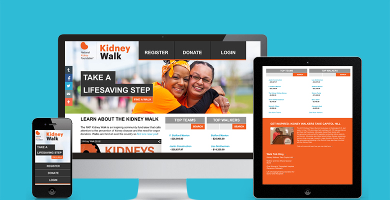
With event participants becoming increasingly digitally savvy, the National Kidney Foundation saw an opportunity to use modern technologies and social platforms to maximize the amount of revenue it generated from each donor, as well as reduce fundraising friction by...

by Kim Keith | Technology
Everyone wants to be “mobile-friendly.” In Part One of this two part series, we examine two often confusing terms in web design and development: Adaptive and Responsive. It’s common for these terms to be thrown-about interchangeably, but they don’t mean the same...

by Charity Dynamics | Technology
You can’t improve what you’re not measuring! Here at Charity Dynamics we are all about User Experience (UX). Not just the pretty, but the effective and user-focused design of digital experiences. But how do you know if something is effective or not? For now let’s...

by Charity Dynamics | Technology
Are your constituents getting frustrated that they’re still being asked to login even though they have selected the ‘remember me’ check box? If so, this means a negative tone has been set before they even enter the participant center. As a result, this is most...

by Kim Keith | Technology
“Cheap, fast or good – pick two.” This maxim rings true over and over again for any development project. When developing email projects, the “ring” can become a deafening siren. Despite predications otherwise, emails are still the backbone of giving...
by Kim Keith | Technology
Creating the smoothest and most pleasant donation process possible is a critical step in refining the overall user experience (UX) for people who use your website. The rationale for this is obvious: when you make it easy and fast for people to donate to your...


