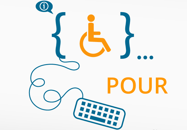
With so much of our lives taking place online anymore, web accessibility, or the ability of those with disabilities to access the web just as fully as those without disabilities, is becoming increasingly top of mind for businesses and organizations (and legally necessary, as well).
Web accessibility is guided by four main principles, which you can remember by the acronym POUR. The POUR Principles are designed to make your organization think beyond the more obvious visual or hearing cues to include physical and cognitive impairments as well.
To be web accessible, you have to pass all four of these guidelines. POUR is outlined by the Web Content Accessibility Guidelines 2.0 (WCAG), and will help you ensure your site is accessible to anyone who visits your website.
To help you better understand the four POUR Principles, here’s a quick guide to what each means and a few examples to give you a little more detail.
- Perceivable: When thinking of perceivable, you should be focusing on the experience through either sight, sound, and touch. All users, no matter what their ability, can have the same experience.When thinking through Perceivable, you should consider:
- Making sure all images are using alternative text
- You enable a transcript with all audible and video files on your site
- Be sure you have ample contrast between your text and any background
- Operable: When thinking of operable, your site must be able to be navigated using various input methods. So either by keyboard, mouse or voice recognition, a use should be able to move around your site effortlessly.When thinking through how operable your site is, you should consider:
- Clearly define the purpose behind each link on your site
- Be sure to utilize headings correctly to provide content and structure
- You should be able to pause or stop timed and blinking content
- Understandable: Simply put, your content and navigation needs to be easy to understand and navigate. When I was in journalism school, many of my professors pushed us to embrace simple writing. More people will understand the message they are receiving and you’ll never confuse your audience. Well, my friends, the same goes for your website!When thinking through how understandable your site is, you should consider:
- Removing “internal speak” your organization uses or if you have to use it, explain it
- Provide summaries for really long articles
- Identify your site’s language preferences in code to help with screen readers
- Robust: And the last principle, robust, is my favorite. If you do anything on the web, you know how important it is to be responsive. Being a fully responsive site, which allows a website to work across any operating system, browser and mobile devices, makes your site robust!When thinking through how robust your site is, you should focus on how your site performs in different browsers, on a Mac vs. a PC and all the various models of mobile phones in the world.
Again, if any of these principles is not true for your website, then you risk excluding website visitors. And why on earth would you want to do that? An accessible site truly gives your organization access to anyone, anywhere in the world. It’s a bigger reach for you to get your message out and get connected.
Next week we’ll talk about the layers of guidance for each of these principles. Oh yes, accessibility has layers just like everything else in this world. Once you learn the layers, you’ll be able to tackle this head on and become an accessibility rock star. Stay tuned…

